Blue Prism Brand Upgrade
When I joined the company, the brand was awash in a monochromatic style and a sensibility that was heavy and felt dated. It also was not particularly agile and required heavy use of stock images, ending up with a "multiple people staring at a single laptop" aesthetic that was, in a word, uninspiring.
After gaining enough clout :), I created a video on a Friday evening and presented it to senior management Monday morning that described a complete redesign of our branding direction that incorporated color, illustrative design, and an overall cleaner, more modern look. I was able to get everything but the redesigned logo approved (too much money involved to change the logo) but was able to eliminate the logo geegaw of the overly complicated pyramid puzzle, so....compromise win!
Additional to the new brand guidelines we redesigned the corporate web presence and all of our major collateral types, completely in-house, completing 90% of this work inside of 3 months with just 4 full time people. This look is now being adapted to our application design, which I am also shepherding along with the UI staff. My past experience in software development helps me ensure that I don't ask for things that are technically unfeasible, which I think they appreciate!
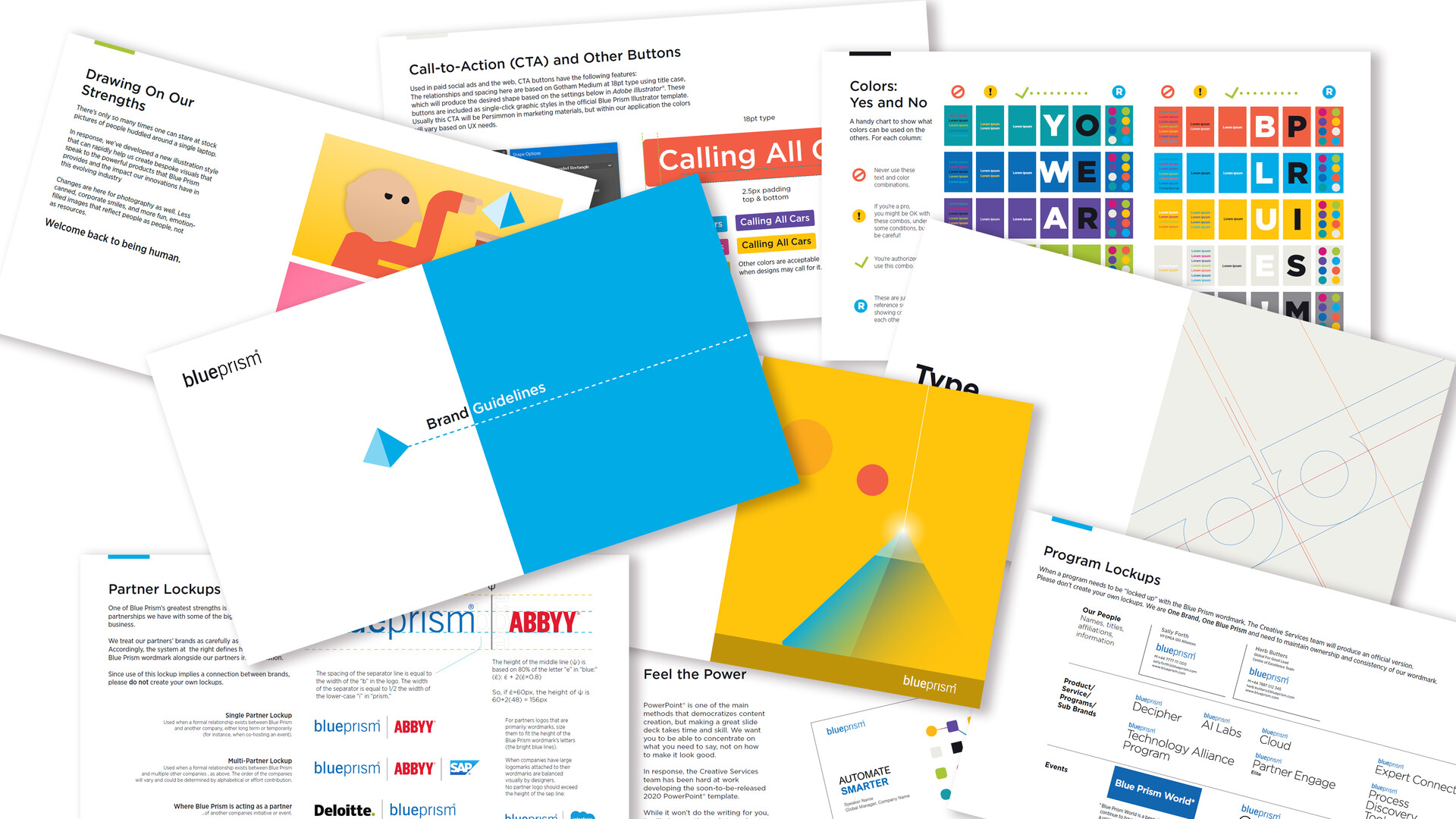
Brand Guidelines - 36 pages of prescriptions and proscriptions to guide employees and fellow designers in applying the brand consistently.
The original presentation/teaser to convince upper management of the need for the rebrand and simplification.
Provided base art and animation/art direction for external animators; this was a good first test of our evolving brand system to see how others could put the work into use.
Re-edit of the our first full-length video using the new system to fit a website hero loop.
Internal Global Sales Kickoff opening art, animation, and logotype.
A looping street scene that was used as a background for an internal brand launch video; creative services staff would explain aspects of the rebrand from windows in the buildings and trolley. The camera would pan and zoom to each new location on this img

One of my jobs in to mentor juniors; here I'm showing a step-by-step for a designer asking how to build a puzzle cube that can be exported and animated in powerpoint.

As a multinational company we translate our work into several languages. To that end, we make heavy use of data-driven graphics to automate our output, a movement I spearheaded and trained people for.

Old & Busted

Bland & Boring